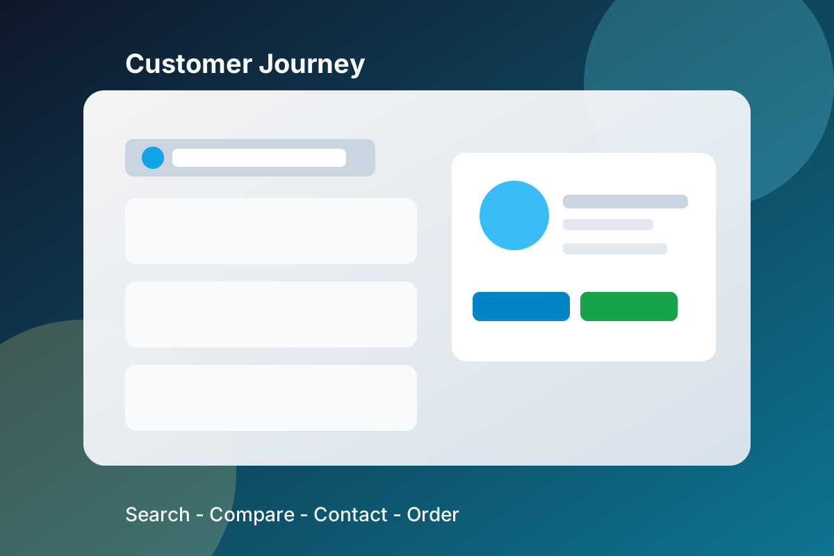
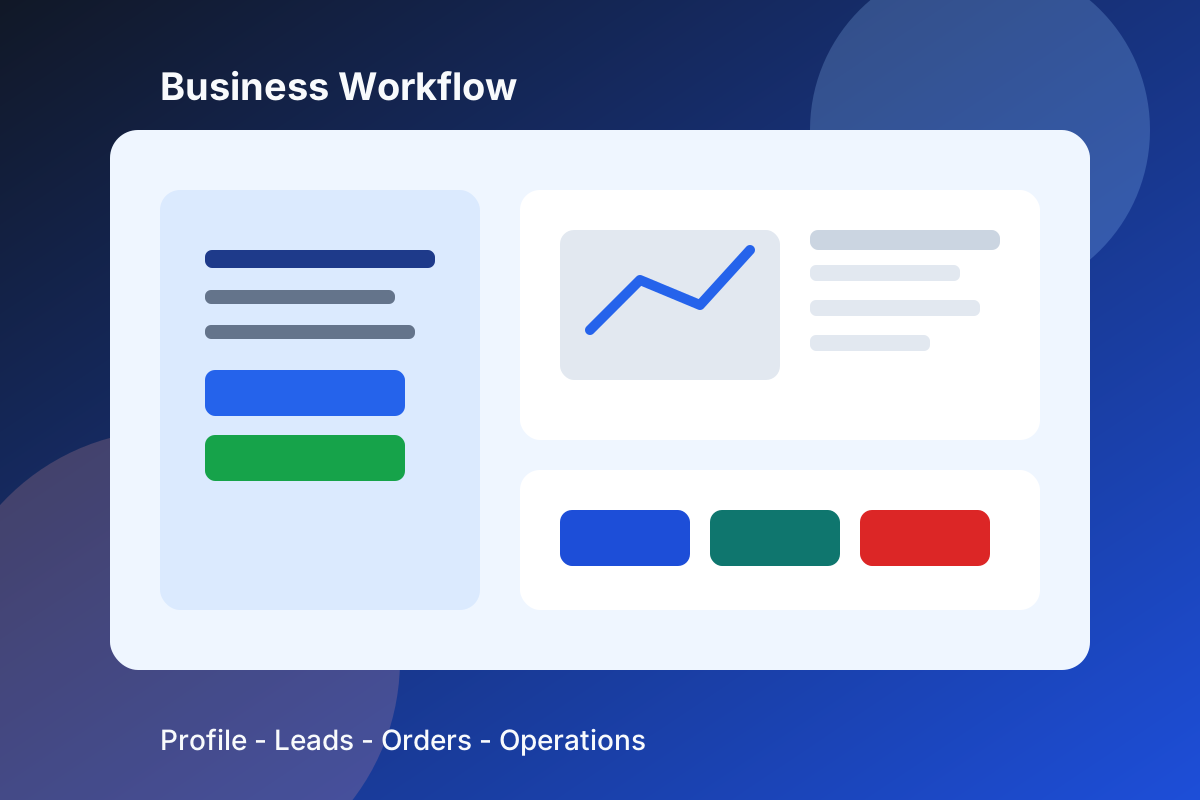
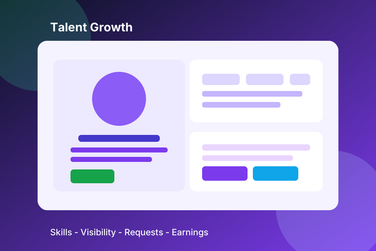
When people land on Bizniz.fi, they usually want a fast answer: which business can help, which service is available, or which local talent fits the job. The homepage is designed to answer that question quickly with clean navigation, focused search and clear next steps.
That is why the front page uses one main search flow, a small set of discovery routes and supportive copy around the H1. It keeps the page readable for visitors while also making the topic of the page obvious for search engines.
If you need something more specific, you can narrow by city, category, service type or talent profile and move directly to a profile page. That keeps the experience practical for real people instead of forcing them through a long series of clicks.
The browse pages are intentionally simple. They give you a way to move from the homepage to businesses, services, products, talents, flea market items, boat mode and must-visit content without losing the thread of what you were trying to find in the first place.
That layout also helps when you return later. Clean links, stable pages and a consistent search entry point make the site easier to revisit, easier to share and easier for search engines to understand over time.
For visitors, this means less guesswork and fewer dead ends. For the site, it means more precise pages, clearer intent and a stronger connection between the words people type and the pages they land on.
The result is a homepage that works as a practical starting point rather than a wall of marketing text. It gives enough context to be useful, but still keeps the search action front and center.